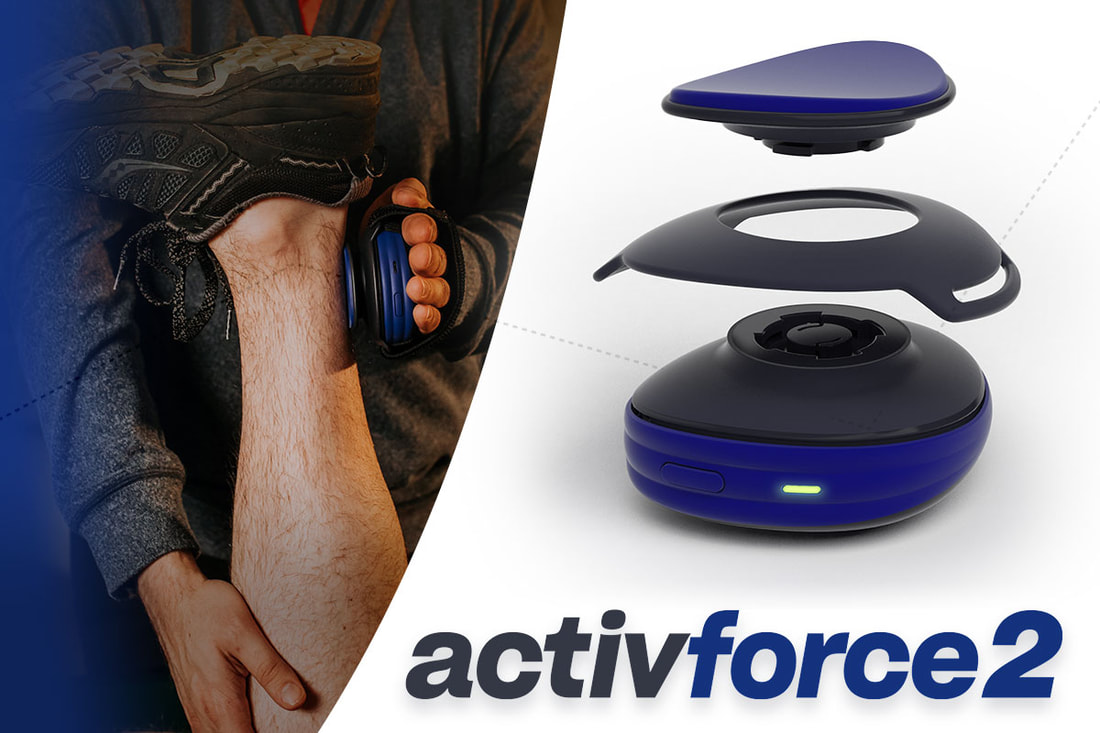
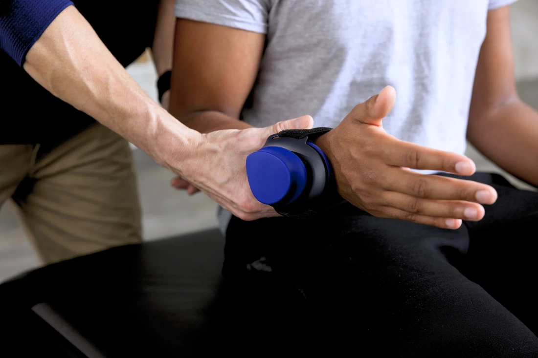
What is Activforce 2?
It's a portable, medical-grade device that combines two important measurement tools used in physical therapy and rehabilitation.
- Dynamometer: Measures muscular strength (force exerted).
- Inclinometer: Measures range of motion (how far a joint can move in different directions).
- Data Collection: Wirelessly connects to a user-friendly mobile app. This allows therapists to record and track patient data over time.
|
Key Uses
Why it's Valuable
|
|
Overview
My role on the project was to serve the team and its users as UX Designer and Product Manager. A previous existing product at Activbody called activ5 caught the attention of a physical therapist at a fitness product expo and he wanted to see its use in the clinic. My task was to help launch this new product with maximized usability, increased test speeds for clinician testing, and ensure medical device requirements for global regions. In order to accomplish this, I would share research proposals to stakeholders to explore product ideas through user research, prototyping, and iterating.
My target demographic is physiotherapists/physical therapists in neighborhood clinics, professional sports medical rooms, and government health standard offices across the US, UK, EU, Japan, Brazil, Canada, and Australia. I would be meeting with users in person and over video calls to explore solutions using Adobe Xd, Zoom, Android/iOS mobile devices, and Google Workspace. My teammates include professionals in software testing, web/iOS/Android development, industrial design, engineering, manufacturing, and medical device requirements.
My role included leading the team with casting vision, app update sprints, future feature updates, product design, marketing analysis and goals, and approaching design to all of these using the user-centric design process. I love projects like these because I am able to use my creative design skills, flex my strategic marketing strengths, and interact with interesting people from around the world.
Challenge
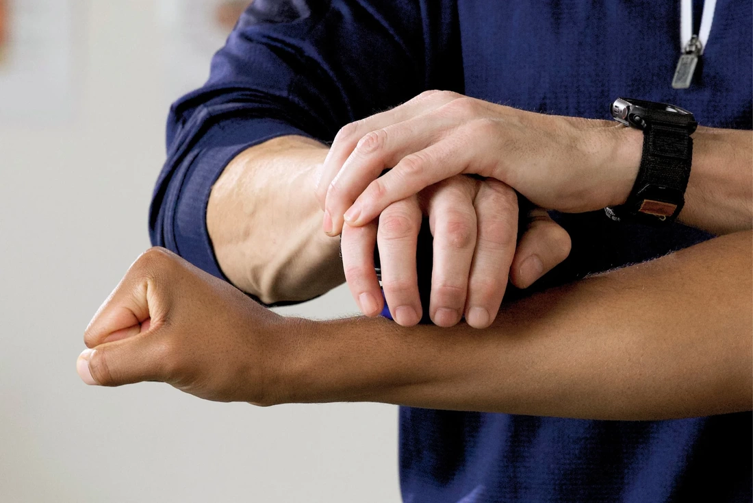
I was brought in after the first version of the Activforce was created using the activ5 product form factor. Therapists from around the world caught word of the first rendition of the product and it was excitedly accepted. The evidence from physical therapists need for an affordable and portable product was clear. The problem that was identified is that many clinicians struggle to retain their patients for the duration of their prescribed visits due to the subjective nature and inconsistency of the Manual Muscle Testing (MMT) technique.
This led to the question, "How might we create a tool for physical therapists to quantify and store data in order to better serve their patients without slowing down the process?"
This led to the question, "How might we create a tool for physical therapists to quantify and store data in order to better serve their patients without slowing down the process?"
ResearchMy initial start in researching solutions to the problem was taking a close look at the research that the company had already generated. There was some initial conversations started with a handful of physical therapists, mainly in the U.S. One particular therapist was brought on as a consultant for faster feedback and iteration. The data skewed towards this one user and what this user's requests were struggling to make it to consideration.
Gathering more data from more perspectives will help make this product more valuable to more people as well as flush out narrowed design thinking. I put together a proposal for 60-minute qualitative interviews with moderated usability testing on the latest version of designs. Users would be invited to participate in the interviews from a pool of people who submitted feature ideas or usability problems through customer service. This broadened the pool of users to Australia, UK, France, Germany, and Netherlands.
When generating the research plan, I formulated the questions in such a way to prevent biased responses. How a user interview is conducted and how a question is asked can change the user's answer from an honest original idea to a coerced delivery of what they think they need to say. In all of these interviews, my most productive question has been, "What are your thoughts?" Keep in mind, these are all users who reached out to the company to provide unwarranted feedback on a product that they feel has the potential to become something they value. In these interviews, they sitting with a company representative that is showing that they want to hear their feedback. The result is a product that has measurable value before it launches and loyal customers that feel like the company cares about them.
After completing 40 hours of heuristic interviews over the course of 2 weeks with users from 6 countries, it was time to take the collected information and organize it.
|
|

|
AnalysisUsing Post-It notes to visualize the most commonly expressed user pain points, I was able to prioritize changes and designs. One particular pain point showed up in every interview and that was the test name entry feature.
This particular feature is where a therapist would enter a name to their test in order to organize the data on their end. This step is optional before each test is performed. The problem came out in user interviews. As an example, a therapist performs 6 tests for their regular protocol on the shoulder joint. This means that the user types out "Seated Shoulder Adduction," then performs the test. Next, they type out "Seated Shoulder Abduction," then perform the test. Same thing for the other four protocols related to the shoulder joint. As a result of this slow process, users were just skipping the test naming process and returning to their manually documented process.
Returning to the question, "How might we create a tool for physical therapists to quantify and store data in order to better serve their patients without slowing down the process?" The current set of designs was failing in that last part. Clinics thrive on the number of patients they can treat. If the process to test a patient is slow, this means the clinic suffers. By matching or speeding up the process, therapists can see more patients, and clinics thrive. Apparently, this was not the first time the small Activforce team had been presented with this problem.
Making sure the users' voice is heard may require repetition. After recognizing the pattern of users mentioning a particular pain point, I presented it to my team in a team meeting. Turns out, that wasn't enough. Keep in mind, we're working at a sprint pace trying to accomplish something that would normally take double the time. After another week of user research, I revisited it again and the same for a following week until my team was able to acknowledge that addressing this pain point is worth integrating into our proposed features.
|
IdeationAt this point, I started to brainstorm and generate a wide range of potential design solutions with stakeholders. This involved creating user flows, sketching screens or features, and designing initial rough wireframes.
The initial wireframes I created were basic visual representations of the product's layout and structure. This not only helped me visualize the user interface and identify potential issues early in the design process, it also helped the development team identify potential issues with development. The next step was designing a low-fidelity prototype. This set of designs are meant to be simple, interactive representations of the design solution. I designed these basic digital mockups to allow users from the previous round of interviews to click through the interface and get a feel for the user flow. Also, this will help me verify and validate the proposed design solution with the potential to make fast changes requiring little investment. |

|
|
TestingWhen the designs were finished and reviewed by stakeholders, I would commence the usability testing process. This included two demographics. One is the group of users that proposed the idea. I wanted to run the designs past them as a way to verify that the solution meets the needs of the user. The other group is composed of new users that have little to no experience using Activforce 2. This allows me to get a good idea of how a new user would approach using the product for the first time and bring usability issues to my attention.
After taking the initial user feedback, sketching ideas for solutions, and setting up a user testing environment, I was ready for the first round of usability testing. I was able to conduct fourteen 30-minute user testing sessions with 7 returning users as well as 7 first-time users to get feedback on the low-fidelity prototypes. I was able to observe how users interact with the prototype, identify pain points, and gather insights on how to improve the design.
After the first round of usability testing, I made some minor adjustments to the prototype, updated the testing environment, proposed the same testing plan with the updated designs, and prepped for the next round of usability testing. The second round of usability testing was with 6 returning users and 7 first-time users. |
IterationWhen I brought the feedback from usability testing to the stakeholders at the company, the proposed design solution I created was going to be put behind a paywall by the CEO. He wanted to take the opportunity to generate more income for the startup product team. Based on the initial round of user research, it would be a high value feature and would be something the company could see users would pay for. I struggled with this idea though. I felt like designing a problem then charging users for the solution is dishonest. I set up a 1-on-1 with the CEO to share my thoughts with him. After some good discussion, we settled on a compromise. He shared my concern and wanted me to come up with an even better solution for the problem.
As a user experience designer, it's easy to get lost in the space between user and company. There have been a few occasions that the user has expressed a pain point but the team is distracted with trying to accomplish the features they are selling. As a UX Designer, I make it my aim to prioritize vocalizing the users' pain points because ultimately it will bring more value to the product. The features that were created for this new product are absolutely amazing but don't resolve the biggest point of most physical therapists.
I had my next task, I needed to create a future feature that users would find valuable enough that they would pay for it. For now, I designed a high-fidelity prototype based on usability testing and prepared it for more usability testing. This would only happen after working with the rest of the team to integrate it through the Quality Management System (QMS) protocols and pass it off to the development and testing teams.
|
|
|
Hand OffWorking on a team that doesn't value the UX Process may require educating team members. There are a few teams that I am working closely with that have a long history of doing what they do and they are told that they are great at it. I do not disagree. Similarly to the point above about being stuck between user and company, I often find myself doing something unintuitive because I'm responding to usability testing and user research. This has caused friction quite a few times especially when handing over designs to the development team. They have years of experience and have been putting out great work when a UX Designer stumbles along and basically says, "I have a user-based design solution that will make you cringe because it goes against everything you've done up to this point." It's in times like these that I recognize the necessary time needed to explain why I am making the design decision and agree with the dev team that may be contradicting a best UI practice.
The mobile clinician dashboard interface is what I am referring to. A couple of members on the dev team healthfully expressed disagreement with my initial design proposal. It was not enough for me to explain that the interface resembles a common interface in Electronic Medical Records (EMR) that our users see on a daily basis. They weren't on board until I shared the data from user research that caused me to come to my design decision.
Other than that, design hand offs to the development team have been an enjoyable process. I have found it to be extremely helpful to sit down to present the designs and the why behind as well as provide space for the development team to express possible problems or shortcuts using existing resources. Making design compromises to support the development team has not only led to better collaboration but also higher quality user experience. Additionally, it's in these conversations that the dev team has an opportunity to educate me on the latest impactful changes to iOS, Android, Web, etc.
Each design sprint required sharing time from the other 3 products at the company. The development team would work on a timeline to push updates through in timeframe estimates. As these developments were published, the testing team would thoroughly test the updates and document in the QMS before they were released to the public.
|
LaunchAfter completing the necessary steps for the medical device Quality Management System (QMS), the development team published the updates. The changes were received with joy. The evidence of effective user-centric design is monumental. We were able to turn a 300-tap interaction into a 3-tap interaction. As a result, Activforce 2 saw a 60% increase in usage of the test naming feature.
Consequently, Activforce 2 started to blow up. Sales tripled. The customer support team started to get inquiries and feedback from clinicians working for professional sports team that wanted a more beefed up version of the Activforce 2. I was onto creating a feature roadmap for the next two years.
Would you like to see the designs I created?
|

|
Reflection
With this project, I created and improved on an existing tool to meet multiple user needs. Additionally, the product itself disrupted the physical therapy dynamometer market. The cost of the Activforce 2 was hundreds of dollars cheaper and provided more utility than its closest market competitor. This lead to Activforce 2 being the choice for physical therapists around the world.
Investing in UX design is key for businesses aiming to create successful products and services. By prioritizing user needs, refining designs through feedback, and testing with real users, UX designers craft experiences that are both useful and enjoyable, benefiting both the users and the company.
Investing in UX design is key for businesses aiming to create successful products and services. By prioritizing user needs, refining designs through feedback, and testing with real users, UX designers craft experiences that are both useful and enjoyable, benefiting both the users and the company.
If you have any questions about this project or hiring me for a problem you're trying to solve, please connect with me. If you're interested in what is public information for this project, visit activforce.com.